
Hi, my name is Malia and my presentation is about Corita Kent.
So, to start I my project I looked up her work.

Then I looked up who Corita was.
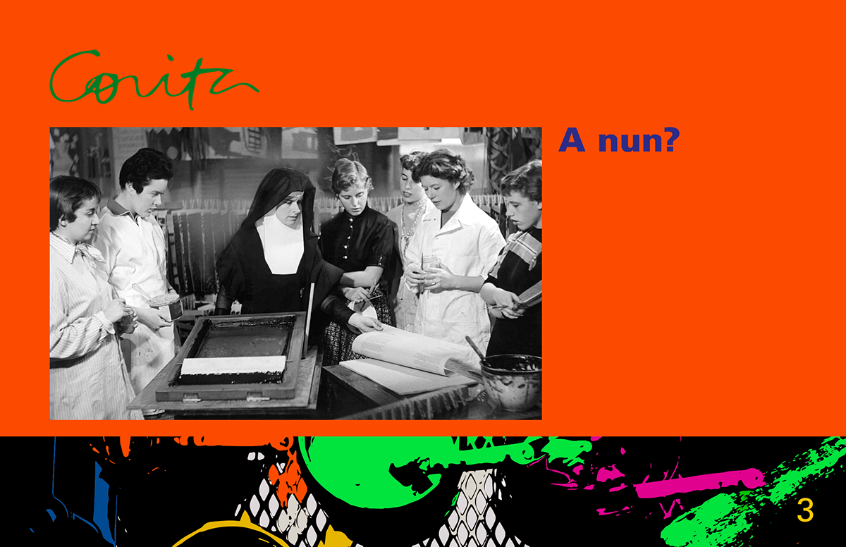
What does my instructor think I have in common with a nun?

Corita Kent was an artist, designer, nun, teacher, feminist, antiwar activist, and civil rights activist who has been largely forgotten and overlooked. She was a pop artist not only separated from her contemporaries by her gender, faith, and vocation, but also her affirmative focus.

Corita was born Francis Elizabeth Kent, the fifth of six children, in Fort Dodge, Iowa on November 20th, 1918. Her family was poor and circumstances required her family to move to Hollywood, California, when Corita was very young, and her father found work with family members.

At the age of 18 Corita graduated from the Los Angeles Catholic Girl’s High School and chose to join the convent of Immaculate Heart of Mary, taking the name of Sister Mary Corita. As a nun Corita was afforded the opportunity to obtain a Master’s degree in Art, become a teacher, and eventually head of the art department of Immaculate Heart College.

Corita’s early work was heavily influenced by byzantine religious art work. In 1952, she won several prizes for this screen print. Corita is already printing color over color, shape over shape, in part because she decided she didn’t like what was originally printed on this poster and decided to print over it.
My impression is that Corita was essentially populist, which can be seen in her interactions with students, the community, and choice of mediums. Silk screening, or serigraph, was inexpensive, and is still considered a populist art form as its common for t-shirts and protest signs.

Corita frequently visited museums and galleries to be exposed to new art, and to add to the Immaculate Heart of Mary’s collection. Her viewing of Andy Warhol’s work Campbell’s Soup Cans is considered instrumental in her development as a pop artist.

“That summer she produced her first pop print wonderbread that fused the colorful bread wrapper and the Host. A few weeks later on October 11, Pope (now Saint) John XXIII opened the Second Vatican Council in Rome”

In response to Warhol turning a grocery store tomato product into art Corita created this piece using the Del Monte tomato’s ad to bring attention to Mother Mary and the language used in advertising. Unlike Warhol’s cynical reflection of consumerism, Corita is exploring the multiple meanings of advertising slogans and why they resonate with us.

A graphic designer and art historian said "What she got from Warhol, clearly, was that there was this powerful imagery in pop culture that came out of advertising," "And that if you just looked at it from a slightly different angle, you could read all these other things into it, and it already had a kind of power because the audience was familiar with it."
One slogan she appropriated was General Mills' "The Big G stands for Goodness," which referred to the capital G the company used for its logo. "And she turns that into 'G,' 'God;' 'goodness,' 'spiritual goodness,'"

As an instructor, she was beloved but tough. Her assignments were given in multiples: 100 drawings, 5 complete alphabets... “She used to call homework your ticket. If you did your homework, you had the ticket to get back into class.”

Immaculate Heart of Mary was charged from inception in 1848 “to build up society through catechesis of the poor and the education of women.”
Being community minded and dedicated to the modernization of the colleges curriculum, Immaculate Heart of Mary was prepared to hit the ground running at the conclusion of the Second Vatican Council.
Vatican II made significant changes in the church, including mass in the local language instead of Latin, and services conducted with the priest facing the congregation instead of the alter. The goal was to make the Church more accessible to the community.

Corita clearly took this task to heart in her artwork, combining spiritual messages with the common images and slogans of advertising. Here she uses the Chevrolet slogan “see the man who can save you the most.”

Corita also addressed issues that were important to the community such as the increasingly unpopular war in Vietnam. Corita’s work was becoming more and more political.
Unfortunately, the Cardinal that oversaw Immaculate Heart of Mary was very conservative and micromanaging of the sisters. The publicity that Sister Corita was receiving at this point was not helping matters.

The Cardinal launched two investigations into the Immaculate Heart of Mary sisters. Some of the questions investigators asked the sisters were:
“Do you think that the Sisters’ sex life is affected by reading novels? Don’t you think it will take too much time to fix your hair if you were to update your habit? Do you want to look like a little girl? … What did you think of a course on James Joyce taught a couple of years ago at the college? Do you know how pornographic Ulysses is? Do you know why your community is being investigated?”
Sister Corita took a six-month sabbatical in 1968 during which she requested and received a dispensation from her vows, and moved to Boston.

Now, no longer a nun after 30 years, she needed to learn much of what was involved in being an adult on her own, though it never slowed her work.
As playful as this alphabet poster series is, I can’t help but think that Corita is venting some of her frustration that lead to her leaving Immaculate Heart of Mary, and the state of the world in general.

Freed from any constraints of the church, she delves into social-political issues that move her. This poster is a response to the Watts Riots.
“Pop has been consistently portrayed by traditional art history and feminist art writers as transparently misogynist in the same way that pop culture of the 1960s has been characterized as misogynist. Pop Art is often read as being in collusion with pop culture in its denigration of the feminine.”

“Corita Kent in her habit couldn’t very well go hang out at The Factory with Warhol. There wasn’t really room in Pop art’s macho style for women artists.” The announcements for the artists who exhibited at the Ferus Gallery (they were known as “the Ferus studs”) “show them shirtless on surf boards or sitting on motorcycles,” Dackerman explains. “You can’t put a nun in that picture and convey the same message.”
Here is text taken from a Playboy interview with William Sloane Coffin.

“Was the irony and sophisticated critique of the most successful Pop Art really beyond the feminine experience?”
Here Corita uses a cover from Newsweek, and another from Life, along with a diagram of a slave ship, and a quote from Walt Whitman about subrogation.

This is one of my favorites. It includes a quote from Martin Luther King Jr "don't ever let anyone pull you so low as to hate them. We must use the weapon of love. We must have compassion and understanding for those who hate."

Corita doesn’t just report on the world, she asks us to get involved. Here she asks where all our young men have gone (killed in Vietnam).

This is the largest copyrighted work of art in history. Corita has used the rainbow as the biblical symbol of hope, God’s covenant with mankind, as a healing community artwork.
In 1974 Corita was diagnosed with cancer with which she struggled until her death in 1986.
Detractors claim that pop art is about being aloof, therefore work that is affirmative and uplifting is inherently not great pop art. They also essentially take the stance that female artist are too engaged, too concerned with what is moral, too emotional.

Corita was frequently referred to as “Warhol with a conscience.” Perhaps this is what the female perspective brings, a conscience. How could that be a bad thing? As there is a resurgence of interest in her body of work, and Corita’s place is reclaimed in pop art history, I hope that there will be greater room for female voices in art and design.

In this presentation, I created and used a color pallet from a number of Corita’s most popular pieces. For the title page, I used handle with care as inspiration and her signature. The rest of the slides continue the title page background color. Corita’s signature is in the header, and an image of silkscreen paints and tools as a design element is in the footer, which I modified with the pallet colors. The font used is Univers Black which, per my research, was used in the original Wonder Bread logo.

The End.
Questions?
